design
a samplingdesign
a samplingAs design is all encompassing, I have to decide where to start. I'll initially be focusing on a long relationship I had with a wonderful company called Business Interiors Northwest. First up will be some holiday card designs, followed by some posters for their company picnics, and finishing with an anniversary poster.
Some additional content will follow that of the Business Interiors Northwest work, with more added later (and better organized!).
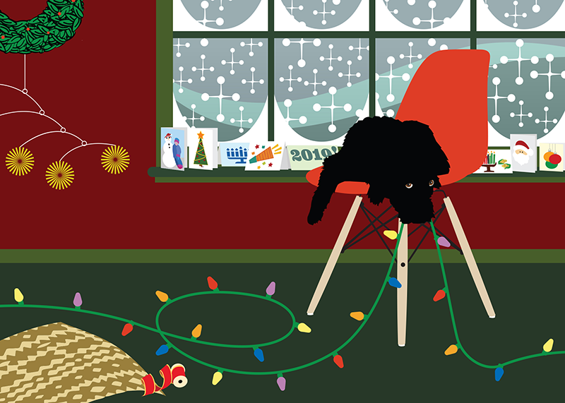
For the holiday cards, the owner of the company wanted something more special and creative than an off-the-shelf card for his employees to send their clients, thereby providing a personal touch too often lacking in the corporate world. The designs were meant to stand out in the sea of holiday cards. The goal was to have the recipients look forward to receiving the card every holiday season, expecting and anticipating something different and fun. It was in keeping with their image as a creative and resourceful company.
The cards incorporated the letters of the company's logo (BiNW) in every card in a considerably less insidious version of "Where's Waldo," though the initials weren't always obvious. On each card was room for a handwritten note from the sender. Pre-printed names of senders were purposely not included, resulting in a more personal touch. Additionally, common element threads were used in the cards, adding continuity to the series, implying a "village" of sorts. Even the "Z" fold design used in most of the cards was meant to further separate the cards from others their clients were accustomed to receiving. The goal was simply to build stronger relationships.
The deeper your level of creativity, the more memorable you become.
As design is all encompassing, I have to decide where to start. I'll initially be focusing on a long relationship I had with a wonderful company called Business Interiors Northwest. First up will be some holiday card designs, followed by some posters for their company picnics, and finishing with an anniversary poster.
Some additional content will follow that of the Business Interiors Northwest work, with more added later (and better organized!).
For the holiday cards, the owner of the company wanted something more special and creative than an off-the-shelf card for his employees to send their clients, thereby providing a personal touch too often lacking in the corporate world. The designs were meant to stand out in the sea of holiday cards. The goal was to have the recipients look forward to receiving the card every holiday season, expecting and anticipating something different and fun. It was in keeping with their image as a creative and resourceful company.
The cards incorporated the letters of the company's logo (BiNW) in every card in a considerably less insidious version of "Where's Waldo," though the initials weren't always obvious. On each card was room for a handwritten note from the sender. Pre-printed names of senders were purposely not included, resulting in a more personal touch. Additionally, common element threads were used in the cards, adding continuity to the series, implying a "village" of sorts. Even the "Z" fold design used in most of the cards was meant to further separate the cards from others their clients were accustomed to receiving. The goal was simply to build stronger relationships.
The deeper your level of creativity, the more memorable you become.
Switching Seasons
BiNW held annual summer picnics. As they were the Herman Miller dealer for the Northwest and Alaska, the thought was to develop some posters using the style of the famous Herman Miller posters. We once again incorporated their initials in the designs. The following are a few examples.
A FEW ADDITIONAL DESIGNS IN NO PARTICULAR ORDER


A FEW ADDITIONAL DESIGNS IN NO PARTICULAR ORDER
