logos
a selectionlogos
a selectionLogo design is extremely challenging and exciting. A logo is your visual identity. It should only be designed once and should last the lifetime of your company. A logo should be strong enough to to convey identity at a glance and be visually appealing. Too much information and the eye passes it by. It has to grab you. It must be memorable.
A logo needs to fit in with the character of your business while leaving no doubt as to who you are. A professionally designed logo is capable of presenting a favorable first impression. We are a visual society. Whether consciously or subconsciously, we respond to visual stimuli. Your logo speaks to the world without having to say a word.
Logo design is extremely challenging and exciting. A logo is your visual identity. It should only be designed once and should last the lifetime of your company. A logo should be strong enough to to convey identity at a glance and be visually appealing. Too much information and the eye passes it by. It has to grab you. It must be memorable.
A logo needs to fit in with the character of your business while leaving no doubt as to who you are. A professionally designed logo is capable of presenting a favorable first impression. We are a visual society. Whether consciously or subconsciously, we respond to visual stimuli. Your logo speaks to the world without having to say a word.
Selected Works
Pike Place Fish Market
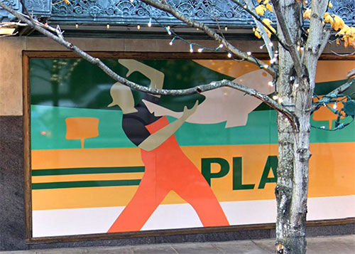
Who doesn't know these famous and entertaining fishmongers? As the logo says, they're World Famous. They, and their logo, have been seen by countless millions around the world. Known for their love of what they do, they're a crowd favorite in the Market's heart. It was an honor to be called to design the first logo change they had in over 40 years.
The Market is the gem of Seattle, it's character has remained intact due to strict stewardship. At the time, the design had to be approved by the Market Authority. It had to reflect the character of the Market. A vintage look was a must.
Creative designs often attract imitators. Amazon, or the artist or artists they hired to create their murals on their 3rd Avenue building, only blocks from the Market, pirated the design, changing it enough to avoid copyright infringement. It's unfortunate they couldn't have been more original.
"Imitation is the sincerest form of flattery that mediocrity can pay to greatness."
Selected Works
Pike Place Fish Market
Who doesn't know these famous and entertaining fishmongers? As the logo says, they're World Famous. They, and their logo, have been seen by countless millions around the world. Known for their love of what they do, they're a crowd favorite in the Market's heart. It was an honor to be called to design the first logo change they had in over 40 years.
The Market is the gem of Seattle, it's character has remained intact due to strict stewardship. At the time, the design had to be approved by the Market Authority. It had to reflect the character of the Market. A vintage look was a must.
Creative designs often attract imitators. Amazon, or the artist or artists they hired to create their murals on their 3rd Avenue building, only blocks from the Market, pirated the design, changing it enough to avoid copyright infringement. It's unfortunate they couldn't have been more original.
"Imitation is the sincerest form of flattery that mediocrity can pay to greatness."

Matt's in the Market
Located on the third floor of the Corner Market Building, Matt’s in the Market is in the center of the Market, offering spectacular views of Elliott Bay, the Olympics, and the Market’s famous clock.
The inspiration for the logo was Matt's simple, intimate, "Seattle" casual elegance in mind.
Market Logo Trivia?
Known only to a select few, the apostrophe and the crossbar of the "t" were meant to mimic the hands of the iconic Market clock just outside Matt's windows.
"Simple can be harder than complex: You have to work hard to get your thinking clean to make it simple. But it's worth it in the end because once you get there, you can move mountains."

Matt's in the Market
Located on the third floor of the Corner Market Building, Matt’s in the Market is in the center of the Market, offering spectacular views of Elliott Bay, the Olympics, and the Market’s famous clock.
The inspiration for the logo was Matt's simple, intimate, "Seattle" casual elegance.
Market Logo Trivia?
Known only to a select few, the apostrophe and the crossbar of the "t" were meant to mimic the hands of the iconic Market clock just outside Matt's windows.
"Simple can be harder than complex: You have to work hard to get your thinking clean to make it simple. But it's worth it in the end because once you get there, you can move mountains."
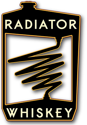
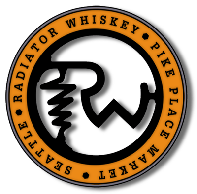
Radiator Whiskey
Another Market gem located across the hall from Matt's in the Market. The logo, as with the Pike Place Fish Market logo, and the Matt's in the Market logo, was designed with the charm and vintage feel of the Market in mind.
Evolution of a Logo
The historic nature of the Market provided the inspiration for the initial version of the logo. In keeping with the inference of the name, a combination radiator/still was created.
“Always carry a flagon of whiskey in case of snakebite, and furthermore, always carry a small snake.”
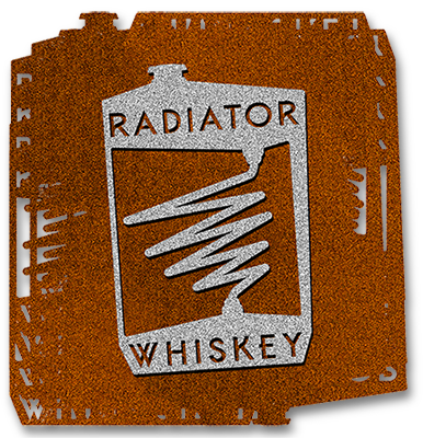
The imagined vision of the logo wall installation.
Large, rusted corten steel at least 6 feet tall. Wishful thinking, yes, but it would have looked great!
Another version, not submitted.
An unfinished, not presented version, but I liked the mechanical/still aspect of the design. You can see that elements of this design ended up in the final logo.
“Well, between Scotch and nothin', I suppose I'd take Scotch. It's the nearest thing to good moonshine I can find.”

Red Mill Burgers
Another Seattle Institution. Serving Seattle's best burgers for nearly 30 years. Babe's onion rings are legendary.
I was hired to refresh their original logo, not to redesign it completely.
“One of the 20 Hamburgers You Must Eat Before You Die”
The 100 Pound Clam
The name is from owner Dan Bugge's family history, going back over 100 years. The name refers to what a harvested bag of clams weighed.
To find out more, visit the 100 Pound Clam.
“She ate so many clams that her stomach rose and fell with the tide.”
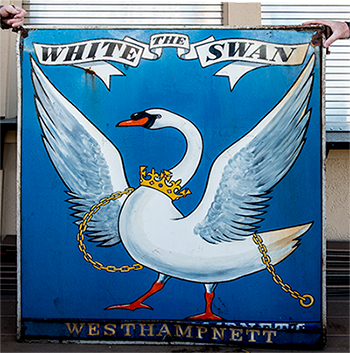
The White Swan Public House
This was a digitizing of a sign for an old English Pub. Owner Dan Bugge bought the sign from an antique dealer.
I did a little research and contacted a pub archive group in England. They provided some background on the original, and were happy to know where the sign ended up and that it was still being used.
The owners were involved in the project for supplying beer "bombs" to their soldiers on the front providing them with a taste of home. I'm not kidding.
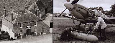
The Original Sign
A photo of the original sign and, below, the original establishment, and the beer bombs.
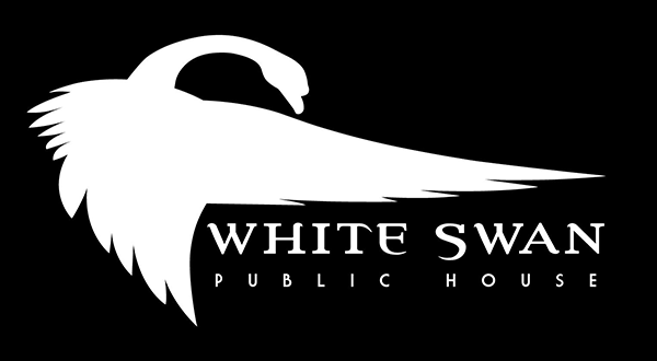
White Swan Public House Logo Variation
I divided the swan into parts as I digitized the old sign. Inspiration struck and I decided to see what I could do with the pieces. I developed this graphic using only those parts. I like to think the swan would be pleased.
The White Swan Public House
This was a digitizing of a sign for an old English Pub. Owner Dan Bugge bought the sign from an antique dealer.
I did a little research and contacted a pub archive group in England. They provided some background on the original, and were happy to know where the sign ended up and that it was still being used. The original White Swan can be seen in the photo below
The owners were involved in the project for supplying beer "bombs" to their soldiers on the front providing them with a taste of home. I'm not kidding. Below is a photo of the "deployment" prep.
The Original Sign
White Swan Public House Logo Variation
I divided the swan into parts as I digitized the old sign. Inspiration struck and I decided to see what I could do with the pieces. I developed this graphic using only those parts. I like to think the swan would be pleased.
A few additional...

A few additional...